
Daily UI, with a twist
Over the last few months, I practiced UI design with Daily UI prompts. They were a great creative exercise, though admittedly, at times I surpassed the one-day scope. Around challenge 33, I changed course to focus more on my case study.
Later on, I revisited a few designs with fresh eyes. Given that the contexts are fictional, they needed to be approached with a grain of salt. But I still found the process of identifying and correcting earlier mistakes to be a great learning experience.
01
Sign up
Deciding on a wellness retreat
A retreat center offers multi-day events on subjects including yoga, nutrition and outdoor activities. Those interested can receive a guide detailing each available retreat by completing the form.
Before

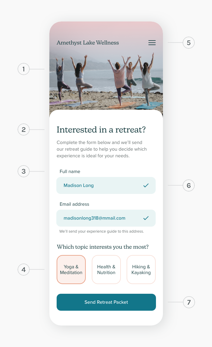 Photo by
 Changes made:
- Included a relevant photo to evoke aspiration
- Made the headline more personable and added explanatory copy
- Specified “Name” to be “Full name” and moved it above the text input field
- Retreat options were reconfigured to be buttons for easier selection
- Added the business name and menu button for context
- Added a check micro-interaction to indicate a valid and completed form field
- Made the "Submit" button copy more specific and changed the color to have a more accessible contrast
02
404 page
Shopping for an old favorite
A clothing store’s error page may occur when someone clicks an outdated link to an item that has since been changed or is no longer being sold.
Before

After
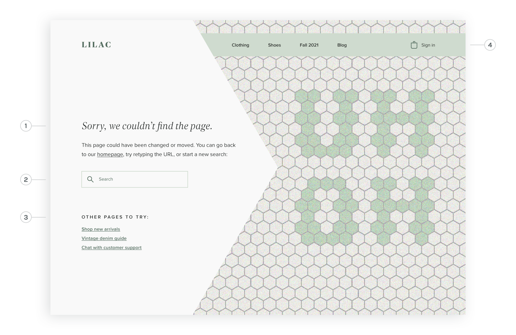
Changes made:
- Added copy explaining the issue and offering suggestions
- Included a search bar to encourage one to look elsewhere on the site
- Incorporated links to popular pages, and an option to chat with customer service
- Elaborated on navigation to include a business logo, more specific site sections, a place to sign in and a shopping bag icon
03
Search
Finding a new pet
A site specializing in cat and dog adoption enables animal shelter employees to post information about their available animals to the site. Those looking to adopt can search for pets in and around their community.
 Photos (top to bottom): 1 & 2 by
Changes made:
- Revised logo color to have more contrast for better legibility
- Brought in a location search field and included the user's location in the page's headline
- Added “filters” label, along with the option to remove filters
- Included copy showing current selections made to collapsed menu items and rotated the chevrons to the correct position
- Age and sex categories were left expanded by default since they are likely to be frequently-used
- Added breed filter
- Included the option to save search settings
- Added the number of search results
- Reworked navigation to include more imperative site sections and indicated the active page with an underline
- Added microcopy to the search field to guide what can be searched for
- Added an option to sort results (sort options would include the distance and the amount of time the posting has been on the site)
- To place more emphasis on the photo, the animal’s information was redesigned to fit on cards
- Copy was added for each pet and formatted into an easy-to-digest bulleted list
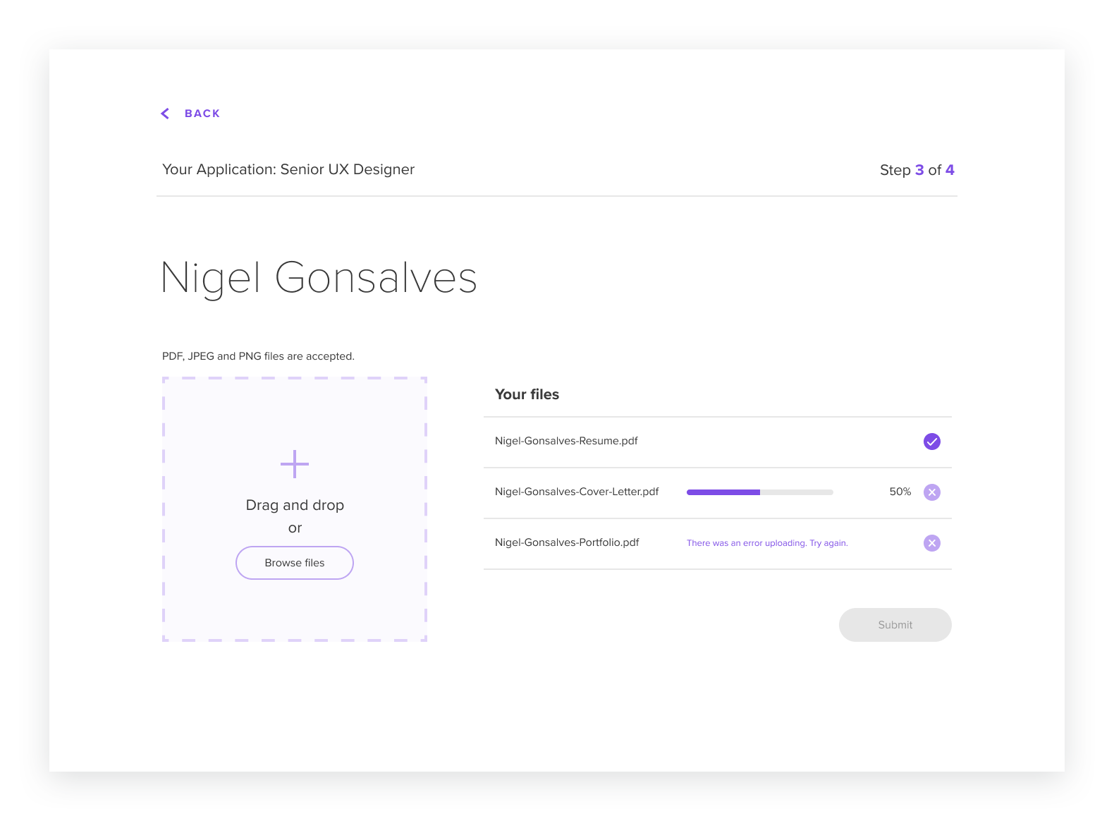
04
File upload
Applying for a job
A job site's interface has a four-step process for completing an application. The third step is a file upload screen, which enables someone to upload files by drag and drop or by browsing their files.
Before
After
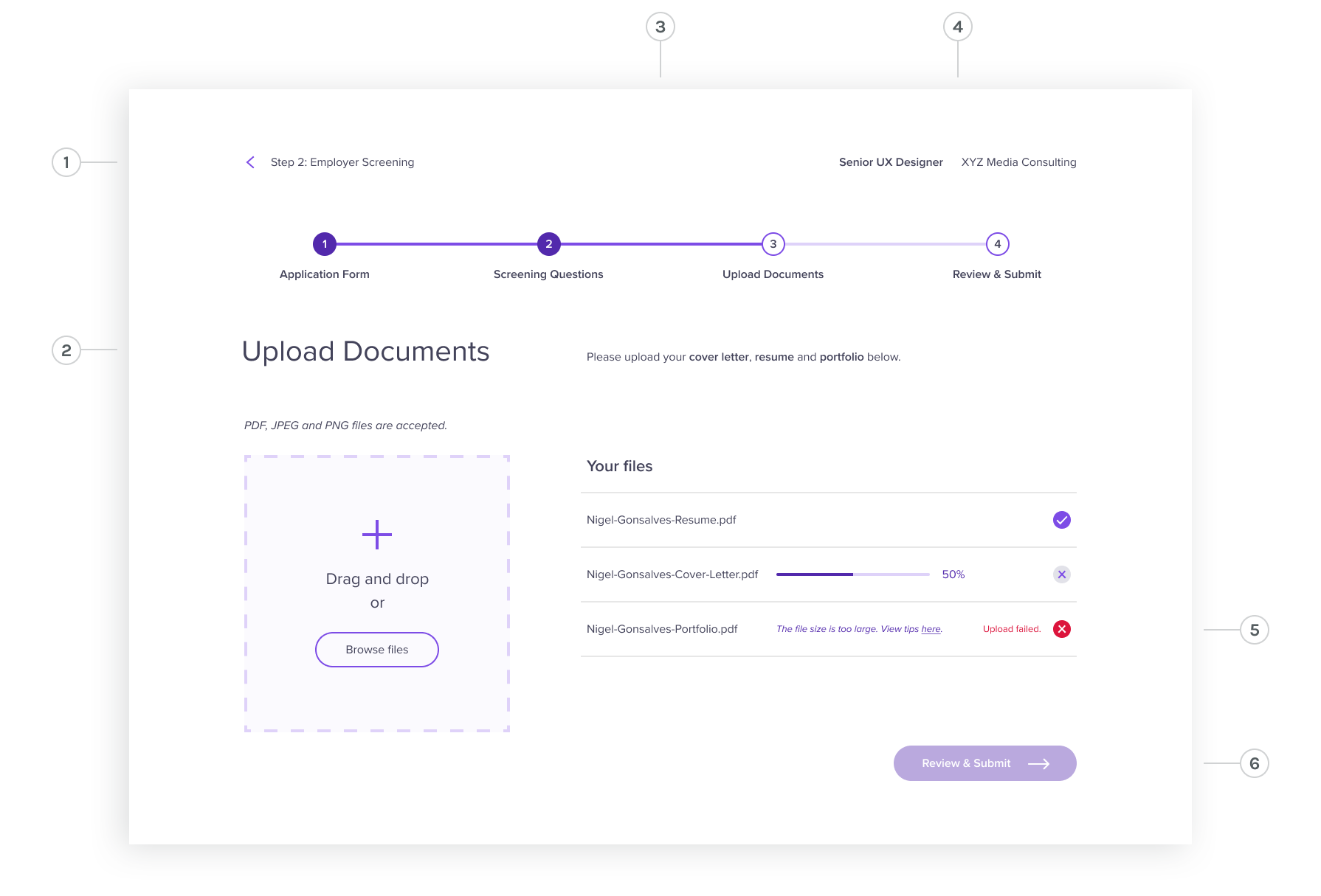
Changes made:
- Specified the text accompanying the chevron to the step that would be navigated back to
- The page's headline was changed to the current step of the application process
- Added a bar showing each step of the application process, along with an indication of the person's progress
- The job title was moved to the top right and the company name was added
- A link to tips on file specifications was included with a more specific error message, and red was added to distinguish the error state
- The button’s label lists the next step of the application process, and the inactive state was revised to a transparent version of purple, providing more clarity that it will become active once the files have been uploaded and the error has been resolved.
05
Crowdfunding campaign
Supporting the community
The nature club for a fictional town, Andvale, is raising funds for the construction of a greenhouse. They have set up a fundraising page with information about the project in the hope that their community will make online donations.

After

Changes made:
- Revised the copy to briefly list the community need and the potential project benefits
- Included images representing each project feature to elicit more excitement
- Reworked the progress bar design to be less clunky and to have more hierarchy between monetary amounts, supporters and the time left
- Made the donate button larger and changed it to a darker color for more contrast and emphasis
- Added the organization's name and site navigation menu, to clarify where the crowdfunding page exists